Thursday, 18 January 2018
Turning point and development of final images
PAN records
After some further research, I decided that the best way to
solve the problem raised in the previous post would be to do what the art
director for electronic music label PAN describes as using indirect references,
often ambiguous to convey a sound visually. This has allowed the artwork
produced for the label to have a clear connection to the music it accompanies
and the ambiguity allows for the viewer to draw further connections in their
own mind between the music and the artwork. This last point is something that I
have been interested in tackling throughout much of the work I have produced
since first year and was therefore keen to bring it into the practical work for
COP3.


Free writing
After a discussion with my personal tutor I decided that a
good way to try and achieve this would be the process of free writing in which
I would listen to pieces of electronic music and jot down the first words that
came to mind and then distil these lists down into a few worst that fitted the
music the best. This would in turn allow me to add motifs to my work that
related to the work within falling into cliché and which would also allow for a
certain degree of viewer interpretation.
Development of final images

Song: Helm - Eliminator https://www.youtube.com/watch?v=0d0Ed0wpo_k
Words: Ancient, Rust, Extraterrestrial

Song: Die Partie - Allerheiligen https://www.youtube.com/watch?v=aKL2ejYPD1I
Words: Defeat, Falling, Burst
Although I was happy with the first two images I created in
response to this, going so far as to print the second image, I felt that they
didn’t quite achieve the effect that I had wanted despite both capturing the
words I had associated with them. I feel like this is because the first image
is too abstract and the second is too figurative. Therefore, I think in my
final images a need to create a careful balance between he two. Furthermore, I
think the colours in both take away from the desired visualisation of the music
in question. The first image, due to the black back ground, feels quite
claustrophobic and lacking in movement. The second in contrast to this has too
much going on colour wise and feels too colourful, giving it an almost
childlike quality.
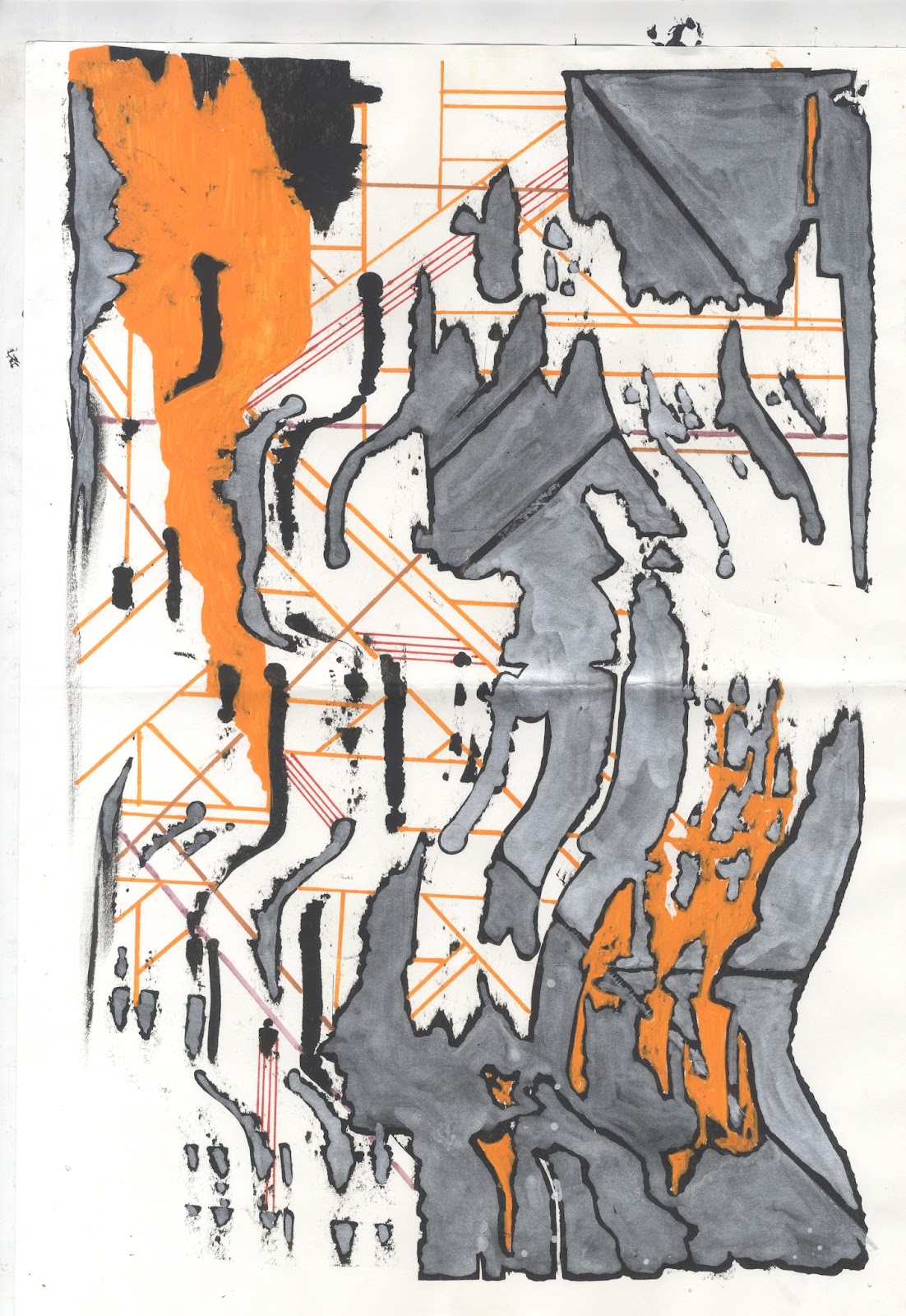
Therefore, with my final images I decided that I would go
for a simple black and yellow colour scheme. This is because the crits had highlighted
my most successful images, purely in aesthetic terms, as being the simple
monotone prints. Whereas in contrasts to this, the tension between black, blue
and yellow in my initial images had been suggested as the most successful way
to visualise the sound and feel of electronic music.
I think in the final images I was also able to achieve a
nice compositional balance that helped further the visualisation of the music.
This is because they still retained some of the looser nature associated with
my initial experiments yet they also have a strong sense of structure achieved
through the use of collaged images and shaped that sit alongside the looser
elements.

Song: Microlith - Remember Members https://www.youtube.com/watch?v=9fuHEFU1s8Q
Words: Running, Freedom, Release

Song: Zov Zov - The Fire Consumes https://www.youtube.com/watch?v=ivGVhx7IXbQ
Words: Esoteric, Apocalyptic, Broken

Song: Pan Dajing - Exile https://www.youtube.com/watch?v=xq14MZesUes
Words: Chaotic, Sinister, Spin

Song: Powell - Club Music(Ancient Methods remix) https://www.youtube.com/watch?v=qGPlJGExMD4
Words: Building, Industry, Power

Song: Richard H Kirk - Come https://www.youtube.com/watch?time_continue=198&v=-6lHuJsY-2c
Words: Clatter, Clang, Create
Further development
Digital Process
Given the nature of electronic music I was keen to see how I
could start bringing in digital processes to try and help with my
visualisations. I was also keen to see how I could challenge the way in which I
currently use digital media and process given that it makes up such a large
part of my practice. However, I was keen to try and still work in a loose and intuitive
manner on screen that would try and capture the visceral feel of the work I had
already created. This is because I feel that quite often I spend ages cleaning
up images digitally and often end up taking away from the initial impact of the
drawing/material in question.
With this in mind I started creating a series of ‘noises’
based around the idea of wave form and distortion. These were created by making
simple marks on paper and then placing them on a scanner and moving around at
different intervals. I thought this was a good way to take the visceral and
energetic approach I had previously achieve with paint and ink digitally as it
allowed for me to create images directly in response to sound. This is because
I could move the paper in time to the rhythms or use different types of
movements (ie smooth, rigid etc) to represent different types of sound.
Furthermore, much like with dragging of paint, there is a certain element of unpredictability
to it with little details and lines only become apparent once the image has
been rendered.
Digital development
Although I liked this approach and found it to be a really
good way to take the visceral nature of my paintings into my digital practice I
felt more could be done to capture the overall feel of the music. For example,
I feel that all my work up to this point has lacked a more structured nature
that I feel captures the rhythms and structures of the dance side of electronic
music.
Therefore, I began experimenting with combing repeated
shapes and lines, created with adobe illustrator with the ‘noise’ scans as well
as with scans of analogue textures I had made. This was so as to bring the
desired structure that I felt represented the bold structures of electronic dance
music without taking away from the freer more intuitive way of working that I
had found to be so successful in initially visualising sound.
I also begun to play with the idea of visually exploring the
process of audio sampling that is so prevalent within electronic music. To
achieve this I took photographs that I had taken and began distorting and
chopping them up with my compositions. I think this helped add a certain depths
and intrigue to my compositions without taking away from the abstract nature of
them.
Initial screen prints
I felt these images had been the most successful so far in
the visualisation of electronic music. I think this is mainly due to how they
have managed to successfully combine each of the different elements and
approaches I have already explored. Given this success I decided to see how
they would translate into print. I was particularly keen to try these images out
as, up until now, I have only screen printed traditional scenic images.
Therefore, I was wanted to see how the different line and marks would transfer
into print.


I was really surprised and happy with just how clear the
images came out with even the smallest lines and dots I had created on adobe
illustrator coming through. Although I tried colour separation with both
images, I think it was only really successful with the second image. In particularly
I like how the fact that I have slightly offset the screens has given the
intricate line a feeling similar to red/blue 3d images.
Reflection
Much of the feedback within the crits praised the overall
feel of the screen prints with the monotone version of the first print being
highlighted as particularly successful. However, some feedback suggested that
the colours present within my analogue images were more successful than the use
of red and blue within my screens.
This is because it was suggested there was a greater sense of
tension and energy with, for example, black and yellow that was indicative of
the music in question. Furthermore, although the inclusion of motifs was
praised and was highlighted as something I should further develop, it was
suggested that the use of a computer board in the second was too cliché.
Therefore, I think I need to evaluate how I can bring in visual motifs in a way
that still relates to and helps visualise the music without falling into cliché.
Initial Development
With my rationale in mind, I started producing rough
paintings in response to pieces of electronic music. Within these I decided to
use a range of different materials that I felt could be used in a visceral and
energetic way so as to catch the movement, energy and noise of the music in
question.
Process
In particular I found ink and paint to be the most
successful given that they allow bold, expressive mark making whilst still
having little nuisances to them. These little imperfections, I felt, helped
further visualise the feedback and static of the musical recordings.


This got me thinking about how I might manipulate and apply
the ink and paint in different ways that might best visualise the different
elements of a recording. For example, dragging the paint with card across the
paper can be used to visualise overwhelming drones and bangs whereas the use of
a small brush to create more intricate patterns can be reflective of subtle
synth lines and melodies.


Joe Seaton aka Call super
When looking for further research and examples of how music
can be represented visually I discovered that an electronic music artist named
Call Super (real name Joe Seaton) also works as a visual artist creating much
of the artwork that accompanies his music.
In an interview for wire he described how for him there is
connection between the process of painting and creating music.
I feel this is really evident in the artwork for his music.
For example, on his album: Suzi Ecto, which is mainly comprised of fiddley, meditative
and intricate sounding music a loose painting, rich in layers and textures has
been created to accompany it. In contrast to this a bold, geometric design with
a minimal, graphic aesthetic has been created for his EP: Migrant which contains
much simpler dance floor orientated around strong beats rather than intricate
melodies and textures.


Suzi Ecto Migrant
Reflections
Although my first visual explorations of music have been
useful in understanding how to translate sound into a image, I think I could do
more to create a varied response to the music in question. In particular I need
to take into account the process used by Joe Seaton whereby to vastly different
final images are created so as to better reflect the differences in the music
in question.
Subscribe to:
Comments (Atom)